


Data Visualization: Unlocking Insights Through Engaging Graphics
Updated on : 10 December, 2024,10:30 AM IST

Image Source: AI-generated
Table Of Contents

- 1. What is Data Visualization?
- 2. Why is Data Visualization Important?
- 3. Key Techniques in Data Visualization
- 4. Interactive Data Visualization Methods
- 5. Popular Tools for Data Visualization
- 6. Comparing Data Visualization Tools
- 7. Best Practices for Effective Data Visualization
- 8. Real-Life Applications of Data Visualization
- 9. Emerging Trends in Data Visualization
- 10. Conclusion
Table Of Contents

What is Data Visualization?
Data visualization is the graphical representation of information and data. By using visual elements like charts, graphs, and maps, data visualization tools provide an accessible way to see and understand trends, outliers, and patterns in data. The primary goal is to communicate information clearly and efficiently to users.
Why is Data Visualization Important?
| Benefit | Description |
|---|---|
| Enhanced Understanding | Simplifies complex datasets, making intricate concepts more accessible. |
| Faster Insights | Reveals trends and patterns quickly, often hidden in raw data. |
| Informed Decisions | Facilitates better decision-making based on clear, data-driven insights. |
| Engagement | Engages users more effectively through interactive and compelling visuals. |
Examples of Real-World Impact:
- Healthcare: Visualizing patient data for early diagnosis.
- Business: Tracking sales trends to forecast revenue.
- Education: Analyzing student performance metrics for curriculum improvement.
Key Techniques in Data Visualization
1. Bar Charts
- Description: Represent categorical data with rectangular bars.
- Use Case: Comparing sales figures across regions or categories.
- Interactive Feature: Hover to display exact values or details.
2. Line Charts
- Description: Connect data points to show trends over time.
- Use Case: Monitoring stock prices or website traffic trends.
- Interactive Feature: Zoom in on date ranges.
3. Pie Charts
- Description: Display proportions of a whole as slices of a circle.
- Use Case: Showing market share among competitors.
- Interactive Feature: Click a slice to reveal deeper insights.
4. Scatter Plots
- Description: Illustrate relationships between two numerical variables.
- Use Case: Correlating advertising spend with sales revenue.
- Interactive Feature: Filter or highlight specific clusters.
5. Heatmaps
- Description: Use color to represent values in a matrix format.
- Use Case: Visualizing website engagement by tracking clicks.
- Interactive Feature: Hover to see exact values or time frames.
Interactive Data Visualization Methods
| Visualization Type | Ideal Use Case | Key Interactive Features |
|---|---|---|
| Bar Charts | Comparing categories or groups | Tooltips, dynamic sorting |
| Line Charts | Tracking changes over time | Zooming, panning, and data annotation |
| Pie Charts | Displaying proportions | Clickable slices for detailed breakdowns |
| Heatmaps | Identifying high/low activity areas | Adjustable thresholds, hover details |
| Scatter Plots | Showing correlations | Cluster highlighting, drill-down filters |
Popular Tools for Data Visualization
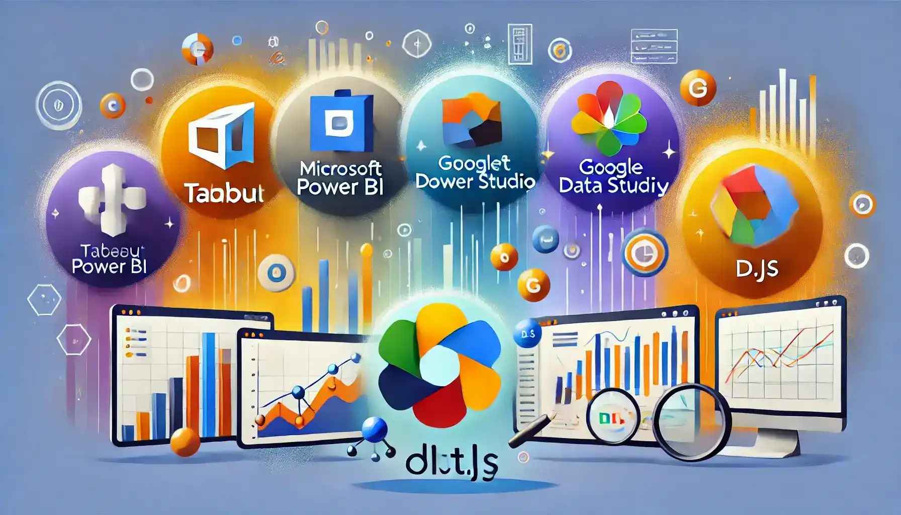
Image Source: AI-Generated
1. Tableau
- Strengths: User-friendly with powerful interactive dashboards.
- Best For: Beginners and advanced users.
2. Microsoft Power BI
- Strengths: Seamless integration with Microsoft products.
- Best For: Business analytics and corporate environments.
3. Google Data Studio
- Strengths: Free and easy-to-use with Google services.
- Best For: Small businesses and startups.
4. D3.js
- Strengths: Customizable visualizations for developers.
- Best For: Advanced coding projects.
5. Plotly
- Strengths: Supports Python and JavaScript for interactive visuals.
- Best For: Technical teams and research.
Comparing Data Visualization Tools
| Tool | Cost | Ease of Use | Ideal For |
|---|---|---|---|
| Tableau | Paid | High | Dashboards and corporate use |
| Power BI | Paid | High | Business analytics |
| Google DS | Free | Moderate | Small to medium-scale reporting |
| D3.js | Free | Low | Custom development |
| Plotly | Free/Paid | Moderate | Academic and technical projects |
Best Practices for Effective Data Visualization
- Know Your Audience: Tailor visuals to their expertise.
- Choose the Right Chart: Match data to its ideal representation.
- Simplify Visuals: Focus on key insights and remove clutter.
- Use Colors Intelligently: Enhance readability and contrast.
- Incorporate Interactivity: Enable users to explore details dynamically.
- Provide Context: Add legends, titles, and annotations for clarity.
Real-Life Applications of Data Visualization
| Industry | Example Use Case |
|---|---|
| Healthcare | Visualizing patient trends for better outcomes |
| Finance | Tracking market performance in real-time |
| Retail | Analyzing consumer buying patterns |
| Education | Comparing student performance across schools |
Emerging Trends in Data Visualization

Image Source: google.com
Sure! Here’s a more detailed and informative version of your list:
- AI-Powered Insights: Leverage artificial intelligence to automatically analyze data and generate dynamic visualizations. These insights can help you spot trends, patterns, and outliers without the need for manual intervention, providing faster decision-making and a deeper understanding of your data.
- AR & VR: Use Augmented Reality (AR) and Virtual Reality (VR) technologies to create immersive, interactive 3D visualizations of data. This allows users to explore data in a spatial environment, providing a more intuitive and engaging way to understand complex data sets and models.
- Real-Time Analytics: Monitor data in real-time to track performance, detect anomalies, and respond quickly to changes. This capability ensures that you can make informed decisions based on the most up-to-date information available, enhancing operational efficiency and agility.
- Collaborative Tools: Enable teams to work together on shared dashboards, reports, and analytics projects. Collaboration features allow for seamless communication, data sharing, and joint analysis, fostering a more productive and transparent workflow across teams or departments.
Conclusion
Data visualization is no longer a "nice-to-have" skill—it is an essential tool for anyone working with data. By combining the right techniques, tools, and practices, you can turn raw numbers into compelling stories that inspire action.
Whether you're an analyst, developer, or decision-maker, the future of data visualization offers endless possibilities to uncover insights and drive meaningful outcomes.


Buy, Sell & Rent Properties – Download HexaHome App Now!

Find your perfect home, PG, or rental in just a few clicks.

Post your property at ₹0 cost and get genuine buyers & tenants fast.

Smart alerts & search helps you find homes that fit your budget.
Available on iOS & Android
Available on iOS & Android


Scan to Download our App
Available on iOS & Android – Download Now!

A Product By Hexadecimal Software Pvt. Ltd.